3.6 单选和复选
3.6.1 单选和复选
单选和复选很简单,只需要一个value和一个属性来维护每个选择框的value即可。
class BaseSwitch extends StatefulWidget {
  @override
  State<StatefulWidget> createState() {
    return BaseSwitchState();
  }
}

class BaseSwitchState extends State<BaseSwitch> {
  @override
  Widget build(BuildContext context) {
    return Scaffold(
      appBar: AppBar(
        title: Text('弹框'),
      ),
      body: Container(
        margin: EdgeInsets.all(30),
        child: _body(),
      ),
    );
  }

  bool _state1 = false, _state2 = true, _s3 = true, _s4 = false;
  Widget _body() {
    Widget w = Column(
      children: <Widget>[
        Container(
          height: 30,
          child: Text('CupertinoSwitchState:$_state1'),
        ),
        CupertinoSwitch(
          value: _state1,
          onChanged: (v) {
            setState(() {
              _state1 = v;
            });
          },
        ),
        Container(
          height: 30,
          child: Text('SwitchStates:$_state2'),
        ),
        Switch(
          value: _state2,
          onChanged: (v) {
            setState(() {
              _state2 = v;
            });
          },
        ),
        Container(
          height: 30,
          child: Text('Checkbox'),
        ),
        Row(
          mainAxisAlignment: MainAxisAlignment.center,
          children: <Widget>[
            Checkbox(
              value: _s3,
              onChanged: (v) {
                setState(() {
                  _s3 = v;
                });
              },
            ),
            Checkbox(
              value: _s4,
              onChanged: (v) {
                setState(() {
                  _s4 = v;
                });
              },
            )
          ],
        )
      ],
    );
    return w;
  }
}
效果如下:

属性和外观
Switch和CheckBox属性很简单,可以设置value来控制是否被选中,需要父级控件来维护,状态改变时也是父级来维护,另外还可以设置activeColor激活颜色,和normal状态的颜色trackColor。
这样子设计组件的好处是,交互交给外部,自己只处理样式,这样子传递的信息可以更灵活。
CheckboxListTile
CheckboxListTile是官方控件,像一个按钮一样,点击任一地方都可以实现选择和取消选择,还可以添加icon,可以控制CheckBox的位置。
我们看下属性:
const CheckboxListTile({
    ...
    @required this.value,
    @required this.onChanged,
    this.activeColor,
    this.checkColor,
    this.title,
    this.subtitle,
    this.isThreeLine = false,
    this.dense,
    this.secondary,
    this.selected = false,
    this.controlAffinity = ListTileControlAffinity.platform,
  })
value是有选中状态,由父组件来维护onChanged是状态改变回调函数activeColor选中状态颜色checkColor选中状态✔️的颜色dense如果为null,就使用主题ListTileTheme.densesecondary和Checkbox对称的组件,可以是一个IconisThreeLine是否是强制显示三行subtitle子标题selected是否选中,默认是falsecontrolAffinity是CheckBox的位置
| controlAffinity | memo |
|---|---|
leading |
checkbox在左边 |
trailing |
checkbox在右边 |
platform |
checkbox典型的样式 |
例子:
CheckboxListTile(
  onChanged: (v) {
    setState(() {
      _checkList2 = v;
    });
  },
  title: Text('checkListTitle  box is trailing'),
  value: _checkList2,
  controlAffinity: ListTileControlAffinity.leading,
),
效果:

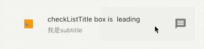
外观
可以给小部件添加icon和子主题,icon一般和checkbox在对称的位置,子主题在主题的下边,当使用默认主题ListTileTheme.dense,文字部件会自动使用系统的样式。
例子:
CheckboxListTile(
      onChanged: (v) {
        setState(() {
          _checkList1 = v;
        });
      },
      title: Text('checkListTitle box is  leading'),
      value: _checkList1,
      controlAffinity: ListTileControlAffinity.leading,
      secondary: Icon(Icons.message),
      activeColor: Colors.orange,
      checkColor: Colors.blue,
      subtitle: Text('我是subtitle'),
      dense: true,
    ),
效果:
RadioListTile
RadioListTile和CheckboxListTile属性基本一致,最大的不同是前者只能由未选中该为选中,选中之后不能继续操作,也就是不能再次点击实现反选功能。
CheckboxListTile(
  onChanged: (v) {
    setState(() {
      _checkList2 = v;
    });
  },
  title: Text('checkListTitle  box is trailing'),
  value: _checkList2,
  secondary: Icon(Icons.message),
  controlAffinity: ListTileControlAffinity.leading,
),

如果觉得不是很方便,可以自定义一个类似这个样式的小部件,我们下边实现一个选中之后可以反选的RadioWidget.
class LinkedLabelRadio extends StatelessWidget {
const LinkedLabelRadio({
this.label,
this.padding,
this.groupValue,
this.value,
this.onChanged,
});
final String label;
final EdgeInsets padding;
final bool groupValue;
final bool value;
final Function onChanged;
@override
Widget build(BuildContext context) {
return Padding(
padding: padding,
child: Row(
children: <Widget>[
Radio<bool>(
groupValue: groupValue,
value: value,
onChanged: (bool newValue) {
onChanged(newValue);
}),
RichText(
text: TextSpan(
text: label,
style: TextStyle(
color: Colors.blueAccent,
decoration: TextDecoration.underline,
),
recognizer: TapGestureRecognizer()
..onTap = () {
print('Label has been tapped.');
},
),
),
],
),
);
}
}
///-------------build widget----------------------
/// 添加到build 中
/// 还需要父组件来维护一个 _isRadioSelected
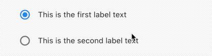
bool _isRadioSelected = false;
LabeledRadio(
label: 'This is the first label text',
padding: const EdgeInsets.symmetric(horizontal: 5.0),
value: true,
groupValue: _isRadioSelected,
onChanged: (bool newValue) {
setState(() {
_isRadioSelected = newValue;
});
},
),
效果:
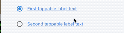
再封装一个附带超链接的Radio,点击超链接,执行回调函数,点击其他区域,执行selected状态变更。
class LinkedLabelRadio extends StatelessWidget {
  const LinkedLabelRadio({
    this.label,
    this.padding,
    this.groupValue,
    this.value,
    this.onChanged,
  });

  final String label;
  final EdgeInsets padding;
  final bool groupValue;
  final bool value;
  final Function onChanged;

  @override
  Widget build(BuildContext context) {
    return Padding(
      padding: padding,
      child: Row(
        children: <Widget>[
          Radio<bool>(
              groupValue: groupValue,
              value: value,
              onChanged: (bool newValue) {
                onChanged(newValue);
              }),
          RichText(
            text: TextSpan(
              text: label,
              style: TextStyle(
                color: Colors.blueAccent,
                decoration: TextDecoration.underline,
              ),
              recognizer: TapGestureRecognizer()
                ..onTap = () {
                  print('Label has been tapped.');
                },
            ),
          ),
        ],
      ),
    );
  }
}

/// ----------------widget-----------------

 LinkedLabelRadio(
  label: 'First tappable label text',
  padding: EdgeInsets.symmetric(horizontal: 5.0),
  value: true,
  groupValue: _isRadioSelected2,
  onChanged: (bool newValue) {
    setState(() {
      _isRadioSelected2 = newValue;
    });
  },
),
LinkedLabelRadio(
  label: 'Second tappable label text',
  padding: EdgeInsets.symmetric(horizontal: 5.0),
  value: false,
  groupValue: _isRadioSelected2,
  onChanged: (bool newValue) {
    setState(() {
      _isRadioSelected2 = newValue;
    });
  },
),
效果:
更多自定义组装在后续章节中会一一讲解,再次不过多累述。