4.3 弹性布局(Flex)
Flex弹性布局,是常见的一种布局,他允许盒子按照一定比例来分配空间。
Flex
Flex组件可以沿着水平或者垂直方向排列组件,如果你知道主轴方向,使用Row或Column可能会更方便点,因为Row和Column都是继承Flex,参数基本相同,所以Flex可以用的地方,基本Row和Column都可以满足要求。
 Flex({
    Key key,
    @required this.direction,
    this.mainAxisAlignment = MainAxisAlignment.start,
    this.mainAxisSize = MainAxisSize.max,
    this.crossAxisAlignment = CrossAxisAlignment.center,
    this.textDirection,
    this.verticalDirection = VerticalDirection.down,
    this.textBaseline,
    List<Widget> children = const <Widget>[],
  })
direction: 指定Axis.vertical它就是Column,指定为Axis.horizontal它就是Row.mainAxisAlignment: 主轴的排列位置,如果文本方向是TextDirection.ltr,start,按照从左向右的开始方向排列,否则从右向左排列。center是按照中间向两边排列,end是按照从结尾向开始方向排列。spaceBetween是两个子组件间隔一致。spaceEvenly是所有的空隙一致。spaceAround开始和结束是中间的间隙的一半。crossAxisAlignment副轴方向,和主轴方向类似,start是排列在开始位置。end排列在底部。center排列在副轴中间。baseline根据基线排列,stretch要求他的子组件副轴方向充满父组件。
效果图:
展示了主轴的常用的效果:

Expanded
可以按照比例扩展Row或者Column、Flex的所占空间。
Expanded({
    Key key,
    int flex = 1,
    @required Widget child,
  })
例子:
Container(
height: 30,
child: Row(children: <Widget>[
  Expanded(
    flex: 1,
    child: Container(
      color: Colors.red,
    ),
  ),
  Expanded(
    flex: 2,
    child: Container(
      color: Colors.orange,
    ),
  ),
  Expanded(
    flex: 3,
    child: Container(
      color: Colors.blue,
    ),
  )
]))
效果:

Spacer
const Spacer({Key key, this.flex = 1})
源码也很简单,其实是封装了Expanded,主动添加了一个大小是0,0的SizedBox.shrink().
例子:
Container(
    height: 30,
    child: Row(children: <Widget>[
      Container(
        width: 50,
        color: Colors.red,
      ),
      Spacer(
        flex: 1,
      ),
      Container(
        width: 50,
        color: Colors.red,
      ),
      Spacer(
        flex: 2,
      ),
      Container(
        width: 50,
        color: Colors.red,
      ),
    ]))
效果:

实际应用
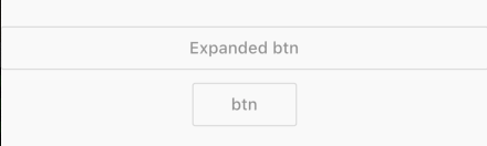
当我们想子组件随着用父组件变大而变大,屏幕变宽而变宽,那么请使用弹性布局.
Row(
  children: <Widget>[
    Expanded(
      child: OutlineButton(
        child: Text('Expanded btn'),
      ),
    )
  ],
),
OutlineButton(
  child: Text('btn'),
),
效果:
如果距离左侧 或者右侧边距20px呢?
Row(
  children: <Widget>[
    SizedBox(
      width: 20,
    ),
    Expanded(
      child: OutlineButton(
        child: Text('Expanded btn'),
      ),
    ),
    SizedBox(
      width: 20,
    ),
  ],
)
效果图:

总结:
如果横着排列请用Row,如果横着有些随着屏幕变宽也变宽,使用Row+Expanded,如果固定间隔请使用SizedBox,如果间隔按照比例分配,请用Spacer
弹性布局比较简单,多用才能有更深理解。